Web design: Document lists
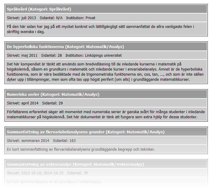
Below I give a screenshot of a document list on this site; the style hasn't changed the last 10 years.

The associated markup is (here I use the third item as the example)
<!-- Serier -->
<table class="singleBorder limWidth">
<tr>
<th class="left"><a href="dokument/serier.pdf">Numeriska serier</a> (Kategori: Matematik/Analys)</th>
</tr>
<tr>
<td>Skrivet: april 2014 Sidantal: 29</td>
</tr>
<tr>
<td>Författarens erfarenhet säger att momentet med numeriska serier [...]</td>
</tr>
</table>The markup is dreadful! Although the problems are obvious, here they are:
- Since the list of documents is ... well ... an unordered list, the
<ul>element should probably be used. - A table should only be used to mark up tabular data!
singleBorder,limWidth, andleftare about presentation; classes should be about content.- The non-breaking space is used to create a visual distance. First, content should not be used to alter the presentation. Second, the non-breaking space is most definitely not supposed to be used like this!
- The metadata isn't marked up properly.
Clearly, this ancient markup had to be improved, and yesterday I changed it to
<ul class="documentList">

  [...]

  <li>
    <h2><a href="dokument/serier.pdf">Numeriska serier</a></h2>
    <dl class="metadata">
      <dt>Kategori</dt>
      <dd>Matematik/Analys</dd>
      <dt>Skrivet</dt>
      <dd><time datetime="2014-04">april 2014</time></dd>
      <dt>Sidantal</dt>
      <dd>29</dd>
    </dl>
    <div class="itemDescription">
      Författarens erfarenhet säger att momentet med numeriska serier [...]
    </div>
  </li>

  [...]

</ul>
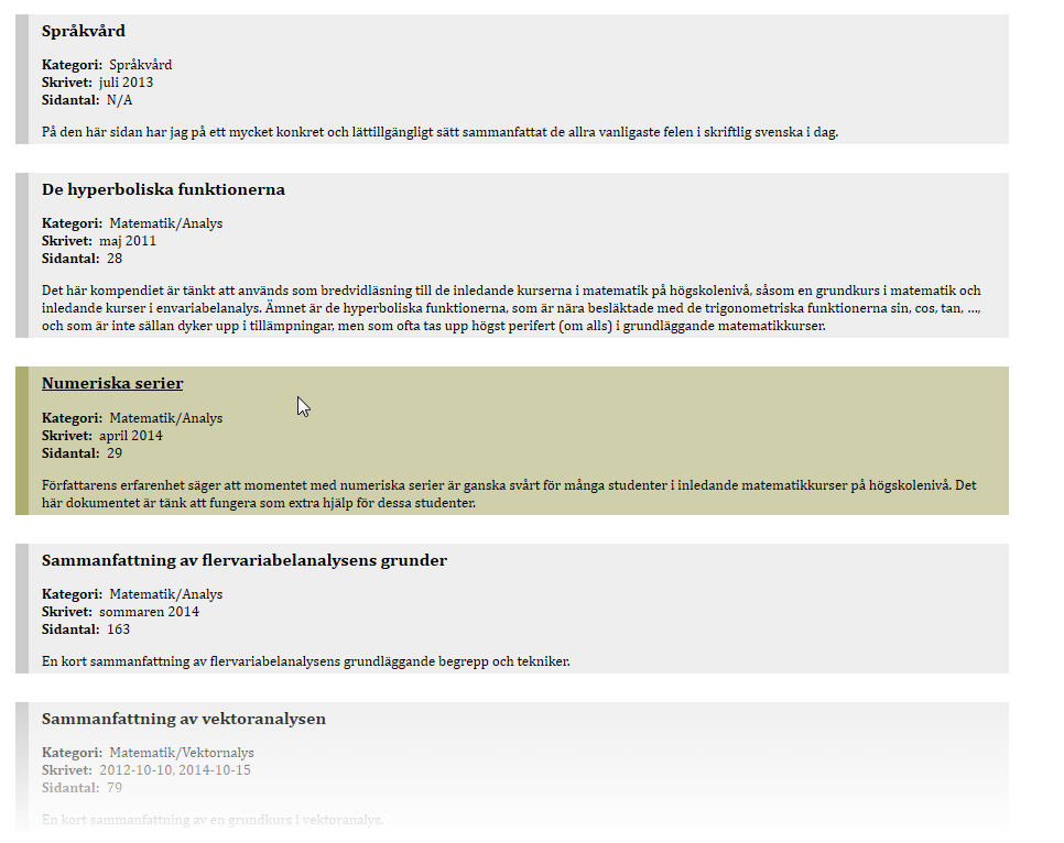
This is, obviously, a major improvement; now the mark up is essentially perfect. The associated style and browser rendering are shown below.
/* Document lists */

ul.documentList {
  margin: 2em 0em;
  padding: 0;
}
ul.documentList li {
  transition: background 250ms, border 250ms;
  list-style-type: none;
  margin: 2em 0em;
  border-left: 2ex solid #CCC;
  padding: 4px 2ex;
  background: #EEE;
}
ul.documentList li:hover {
  border-color: #AEAD71;
  background: #CFCFAC;
}
ul.documentList li h2 {
  margin-top: 0;
}
body:lang(sv) ul.documentList li:lang(en) h2:after {
  content:url("https://rejbrand.se/pix/Flag_of_the_United_Kingdom_small.png");
  padding-left:0.5em;
}
body:lang(en) ul.documentList li:lang(sv) h2:after {
  content:url("https://rejbrand.se/pix/Flag_of_Sweden_small.png");
  padding-left:0.5em;
}
ul.documentList li dl, ul.documentList li div {
  margin-top: 1em !important;
}
ul.documentList li h2 a {
  color: black !important;
  text-decoration: none;
}
ul.documentList li:hover h2 a {
  text-decoration: underline;
}
Initially, my plan was to recreate the original style, but halfway through the process of writing the CSS I discovered that the current partial result actually looked better than the original design, so I decided to divert from my plan; instead, I added some visual candy to the intermediate result. The end result looks much more modern and clean.
Unfortunately, there appears to be a ‘bug’ in IE 6 and below which creates a ‘staircase’ going into the left margin of the page; see a minimal example demonstrating the issue. I ‘solved’ the issue by adding an IE 6-and-below stylesheet with
ul.documentList li {
  padding: 0px; /* To work around an IE 6 bug */
}
Update (2014-11-17 19:28:42): I changed padding: 0px to boder: none. Both make the staircase disappear and the padding is more important than the border.
